Consistency
12 Aug 2012Design consistency across multiple platforms is often heralded as a key goal in the design of a product. The idea being that a product should look and work the same whether or not it’s used on a desktop computer, mobile device, or tablet. While consistency is important, a misunderstanding of it will distract from the real goal: creating a great user experience.
Forgetting this means losing focus of the people using our products. Remember, real people don’t look at iPhone and Android apps and think about how the design is consistent (at least not in those terms). People look at an app and they either know how it works or they don’t.
That said, design consistency shouldn’t be ignored. Rather it should be wielded appropriately. When it’s mishandled or misunderstood, funny things tend to happen. For instance, when design consistency isn’t considered at all it gives birth to products that are completely different from platform to platform. On the other hand, the desire for absolute design consistency is why many Android apps are an exact port of their original iOS version. Both cases mishandle design consistency to the detriment of their users’ experience. So how should we think about design consistency?
Two layers
Design consistency can be thought about in two layers. Not understanding these two layers is a sure fire way to end up with a design that doesn’t respect the user.
The foundational consistency layer deals with the “platform” while the second layer deals with the specific “product”. These two layers need to complement each other in order to create a cohesive product experience.
Platform layer: includes all the design patterns and interactions specific to each platform. This can include toolbar and navigation placement, modal/dialog usage, button sizes, etc.
Product layer: involves all the design patterns and choices that are specific to a particular product. This includes all the features, content, information architecture, icons, colors, typography, etc.
It’s important to evaluate a design decision from both layers’ points of view. The key is to strike a balance that is appropriate for both your product’s users and their platform. To achieve this, we have to force ourselves to think about the user first rather than “consistency” only. To illustrate this, consider Apple’s Camera app that comes on every new iPhone and iPad:
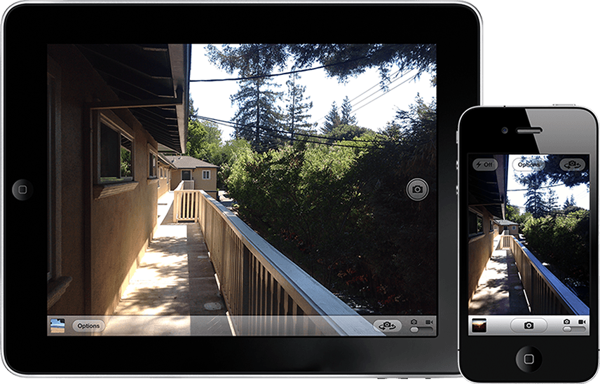
This is a very simple product but take a moment and try to spot all the inconsistencies between the two. Here are a few:
- The iPad’s “Take a photo” button is placed on the righthand side of the screen while the iPhone’s is placed on its bottom toolbar.
- The “Take a photo” buttons are styled differently.
- The iPad’s switch camera button is placed on its bottom toolbar while the iPhone’s is on the top of the screen.
- The iPad’s “Options” button is on its toolbar while the iPhone’s is on the top of the screen.
- The iPad’s toolbar is translucent while the iPhone’s is a solid gradient.
After looking at this quick list it’s easy to think that this simple product is all over the place in terms of consistency. However, if we take a step back and forget about design consistency for a moment, we’ll all admit that it’s still crystal clear how to use the product on both devices. The fact that we can list five (and maybe a couple more) inconsistencies doesn’t change that fact that the interface is clear and familiar. The button placement, while inconsistent, is purposeful for each platform. The “take a photo” buttons are perfectly placed for the user’s thumb while holding each device.
Now take a look at the ways the app is consistent. All of the features of the Camera app, sans the flash option, are available on both devices. They work exactly the same way and the features/options are easily identified because of their consistent use of icons. We could focus on the visual inconsistency all we want, but the product’s content and IA consistency make a larger impact on the user experience.
So what’s the point?
We should take a page from Obi-Wan Kenobi’s book and understand that a design is only consistent from a “certain point of view.” What’s consistent from the platform layer point of view may be inconsistent from product layer point of view. Furthermore, a completely “consistent” design, doesn’t guarantee a great user experience.
Design consistency is a means to an end and we need to treat it as such. When we make design decisions that are concerned with design consistency first and foremost, we lose focus of the people using our products.
So in short, next time you get caught up in a “design consistency” argument, step back and ask what’s best for the user.